Bus Pass
Bus Pass
Cleartrip's Loyalty Program that offers instant discounts on bus bookings for Bus Pass holders, boosting
engagement and loyalty.
Cleartrip's Loyalty Program that offers instant discounts on bus bookings for Bus Pass holders, boosting engagement and loyalty.


01
Introduction
Introduction
The primary goal of introducing the Loyalty Program within Cleartrip's bus booking platform is to boost user engagement and foster customer loyalty. The success of this feature will be measured by the increase in the number of repeat bookings. The Loyalty Program allows users to purchase a Bus Pass, providing an instant discount on multiple bus bookings, including the current one, for a set duration. This exclusive benefit aims to enhance user satisfaction and encourage loyalty among Cleartrip's bus booking customers.
The primary goal of introducing the Loyalty Program within Cleartrip's bus booking platform is to boost user engagement and foster customer loyalty. The success of this feature will be measured by the increase in the number of repeat bookings. The Loyalty Program allows users to purchase a Bus Pass, providing an instant discount on multiple bus bookings, including the current one, for a set duration. This exclusive benefit aims to enhance user satisfaction and encourage loyalty among Cleartrip's bus booking customers.


What did I do?
-Strategy
-Research
-Visual Design
-High-Fidelity Prototyping
-Framework Development
-Quality Execution
-Communication Creation
02
Subscription model across platforms and its success
Successful subscription models like Amazon Prime, Starbucks Rewards, Netflix, and Adobe Creative
Cloud, SwiggyOne, Zepto Pass etc show that such programs drive increased customer retention,
higher spending, and consistent revenue growth. Metrics include higher annual spending, more frequent
visits, substantial subscriber growth, and improved renewal rates.

03
How Did This Product Emerge?
The Bus Pass initiative emerged as a strategic move to enhance user engagement, business growth, and
customer loyalty on the newly introduced bus booking line within the Cleartrip platform. With numerous
travel platforms already offering bus bookings, this approach was designed to differentiate Cleartrip and
foster a stronger connection with our customers.
04
Before settling on a solution, the team pitched a variety of innovative ideas
The Bus Pass initiative emerged as a strategic move to enhance user engagement, business growth, and customer loyalty on the newly introduced bus booking line within the Cleartrip platform. With numerous travel platforms already offering bus bookings, this approach was designed to differentiate Cleartrip and foster a stronger connection with our customers.
DISCOUNT ITIGRATION
Include a pass discount in each bus option, like the current green callout offers, to clearly compare regular and pass-exclusive offers.
NOSTALGIC VISUALS
Use visuals that evoke old bus tickets or passes, creating a nostalgic connection to the physical passes previously used.
PURCHASE & APPLY
Allow users to buy the pass on desktop and apply the offer for the specific bus booking. Benefits can then be accessed through the app to drive user conversion.
05
Will bus pass be available on all platforms?
Following discussions with the entire team, we decided that users would be able to purchase the pass
and access benefits across all Cleartrip platforms, while benefits would be available only through the app
on Flipkart.
06
Challenges and Technical Restriction
Initially, users can only purchase or renew tickets on the itinerary page. Later, we plan to allow these actions on the information page.
This phased approach is due to our current checkout process, which activates only after an itinerary is created. To enable pass purchases without an itinerary, we would need to develop a new payment system, which requires significant effort. Therefore, the team chose to phase this out.
10
"Not capturing the desired emotions?"
I grew up using local transportation for school and college, and I have collected various types of tickets.
I've seen the older, slimmer tickets with basic stamps in Kolkata, as well as the more modern printed ones. Inspired by these, I began my visual design journey. Initially, I wasn't satisfied with the results, as the vital information on the card wasn't engaging or prominent. This led me to explore digital pass options, commonly seen in metro and train systems. So, I adopted several ideas and principles from there, including:


07
We ultimately made a decision based on several factors
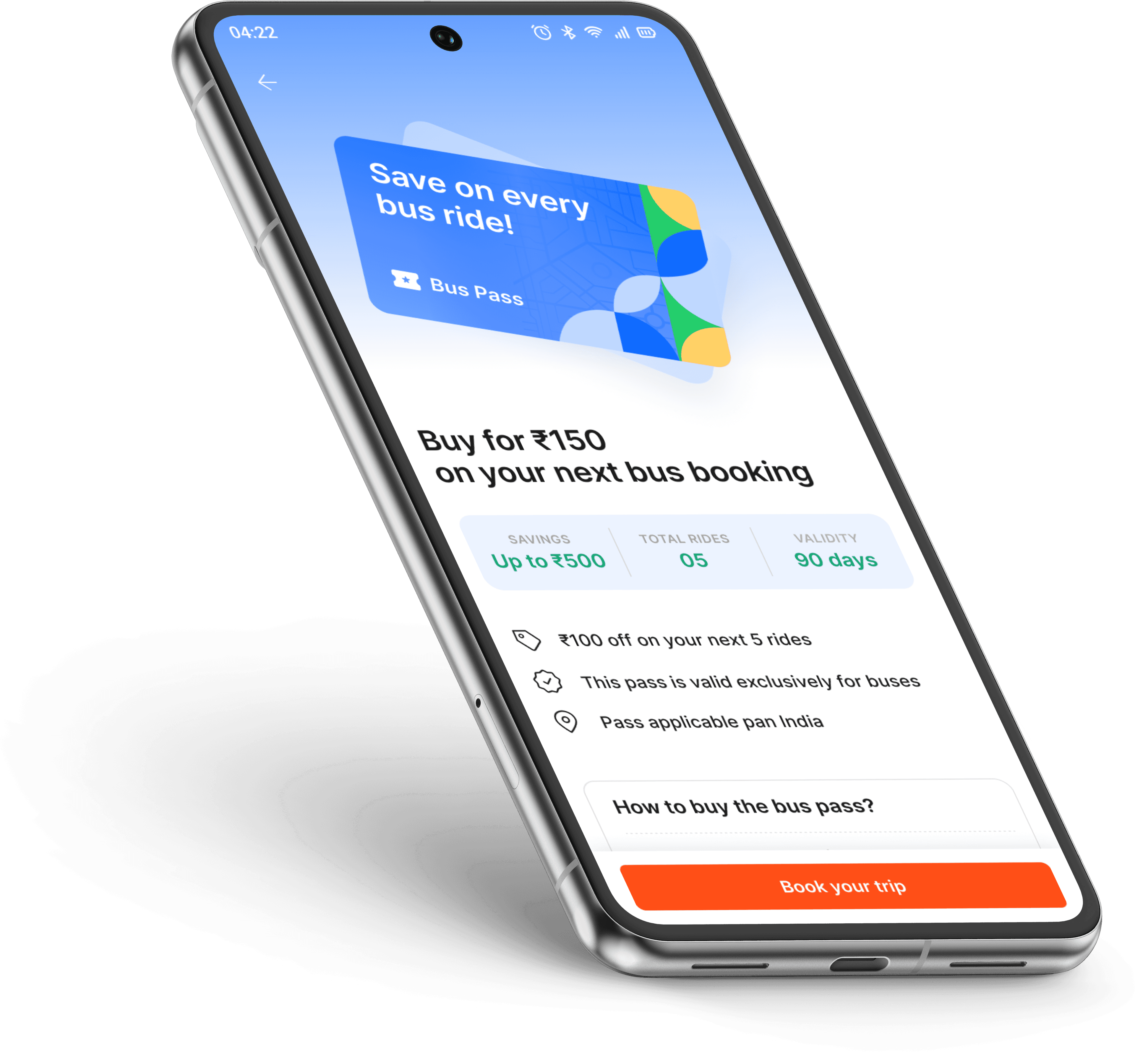
Despite challenges, we chose to implement bus pass purchases on the itinerary page, the final step before payment. To boost recall and interest, nudges will appear on the home screen, search results, and throughout the itinerary and payment screens. A dedicated page will showcase pass details, mimicking the feel of a physical pass. We've also addressed cancellation policies: if a user cancels, the pass discount and redemption count won’t be refunded, but if the operator cancels, both will be refunded.
08
Deciding Factors
RECALL VALUE
Users easily find all relevant information, and improves their experience and satisfaction
MARKETABILITY
Ensures the product appeals to users, leading to greater adoption and success.
THE PRICE OF THE PASS
Affects user perception and accessibility, influencing overall appeal and adoption.
DISCOUNT PER BOOKING
This attract customers, increase sales, and enhance the perceived value of the product.
09
Guiding Philosophy
The concept is tailored for the middle-class segment, who frequently travel with their families. We aimed for the pass to avoid appearing too premium while still being appealing enough to evoke nostalgia for traditional kinds of passes. The visuals, text, and communication are crafted to reinforce these sentiments. Our design principles were:
Clear Information Display: Prominent display of essential details like travel dates and times.
Streamlined Design: Simple, functional layouts that avoid clutter.
Consistent Branding: Uniform design elements that align with the transportation system’s brand.
Modern Aesthetics: Sleek and updated visual style that aligns with current digital trends.
User-Friendly: Streamlined design that enhances user experience and convenience.
11
Initial Explorations
We explored additional options because we haven't yet achieved the desired emotional impact from the cards.
12
More options for the cards
Choosing a widget type required significant patience. With a multitude of options to consider for new, active, and expired pass users, the process was overwhelming.


BUS PASS WIDGETS
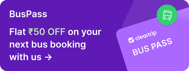
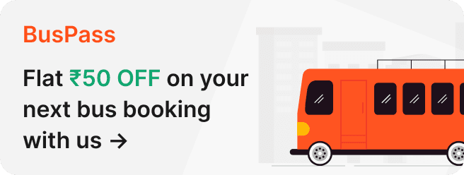
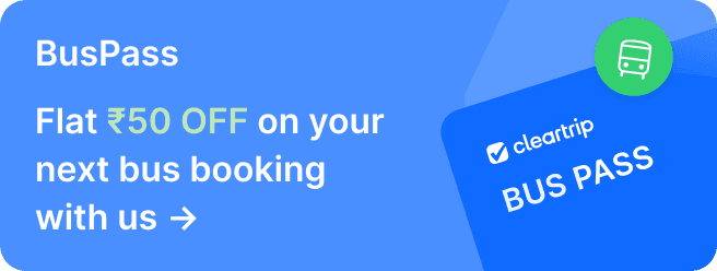
These nudges on the bus home screen establish recall value from the start of the booking process.
13
Following feedback and suggestions from the design team, we were finally able to capture the desired mood
This is the final mechanism of the system, encompassing the process from booking a bus and purchasing a bus pass to enjoying the benefits for a specified period.
Active pass user flow
New user flow
Expired pass user flow
Other Projects
App Push
Tailoring Exclusive App Benefits to Our Audience's Needs
Payment based offers
Streamlined Coupon and Payment Experience
Optimising Packer Incentives in Supply Chain
Challenges & Incentives (Zepto)
Suzuki
Vehicle to everything (V2X) Technology
Doctor consultation revamp
Improving the process of booking consultation online


